

A Redesign That Grew a 0.01% Conversion Rate Into Real Revenue
A thoughtful redesign that aligned customer needs with business goals—plus the right UI polish—transformed a failing insurance purchase flow into one users could trust and complete.
Project Overview
Independence Pet Group purchased Felix Cat Insurance in October 2023. With a bright future as a uniquely cat-only insurance provider, there was a strong appetite to refresh the brand and experience to better meet the needs, and personalities, of cat owners.
However, the main avenue to attain new business, the marketing site’s Quote & Enrollment, was terribly outdated and lacked basic functionality and marketing to sell policies to interested customers. Thus, a redesign of the purchase experience’s UX and UI was priority number one. We set our focus on the goal to increase the conversion rate of policy purchases, to test what product offerings are most appealing to consumers, and how to present them in the most understandable way.
Timeframe: 3 months for Design → Go Live
My Role: Senior Product Designer (solo designer on this team)
Core Contributions: User journey maps, defining & designing the entire UI/UX experience, new design system build, UAT, and accessibility testing
The Problem
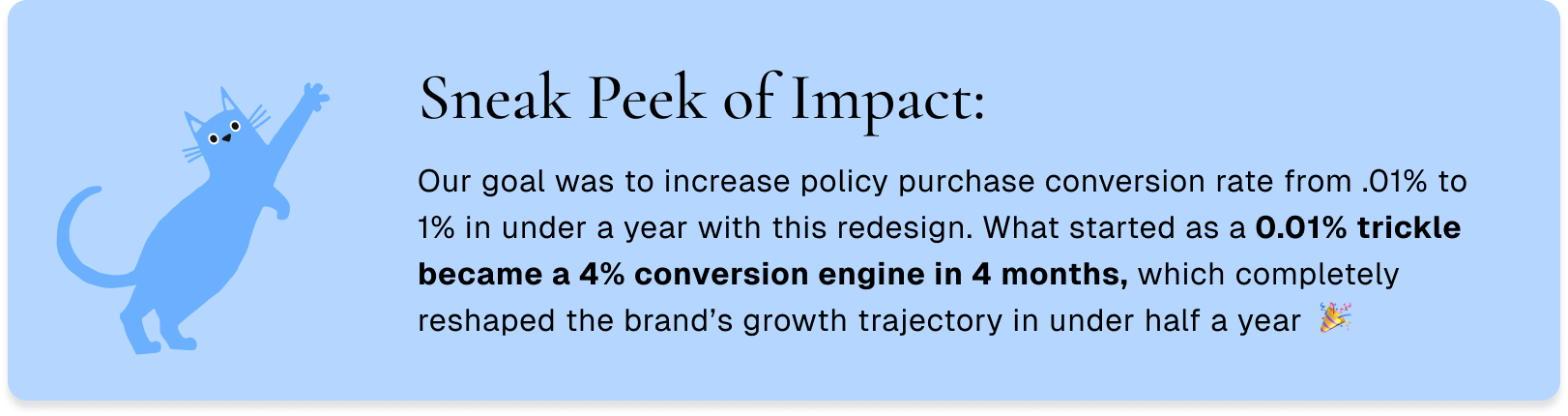
Analysis of tracking metrics indicates that insurance quote conversions to policy purchases are below target, sitting at only .01%. The enrollment experience that every user must go through to purchase a policy lacks clarity, is objectively outdated, and has cumbersome UI. This is a large contributing factor as to what is causing such a low conversion rate, impeding policy sales, and ultimately business growth.

The Solution
A total overhaul and redesign of the UI/UX of the Quote & Enrollment experience was priority number one. To achieve this, the process involved:
Website and product audit
Customer research and feedback
First-time documentation of user journeys and product offerings
New Branding for Felix
Insurance UX
The creation of the Felix Design System and the education on how to use it. No design resources, files, nada existed previous to this project.
User Testing
A delivered redesign Quote & Enrollment flow
Measurable Metrics:
Purchases are converting at .01%. We are looking to increase the conversion rate to 1% within 5 months of the redesign & launch
A functional design system to speed up design → dev handoff
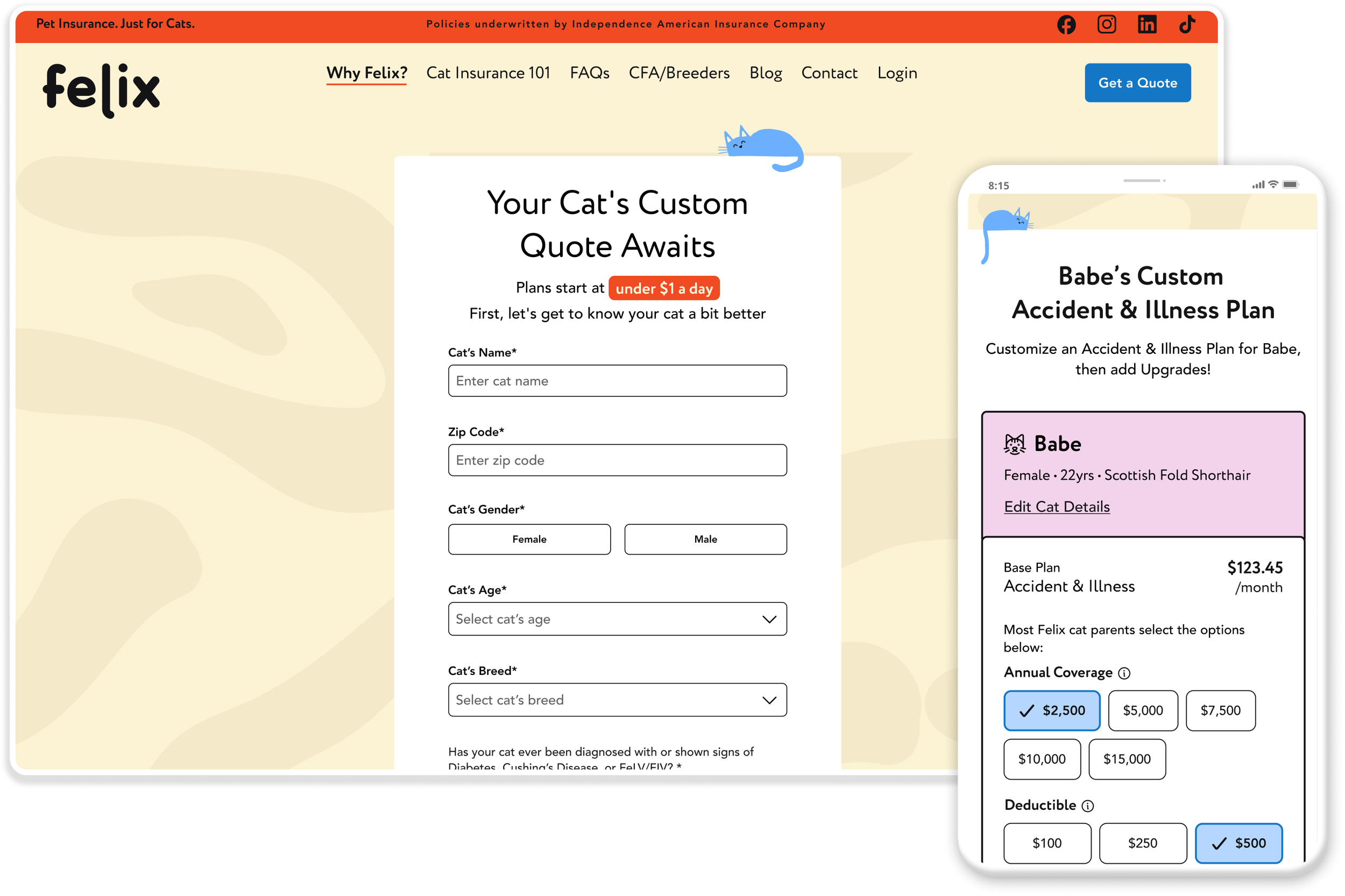
Before

After

Key Learnings from User Testing & Audit
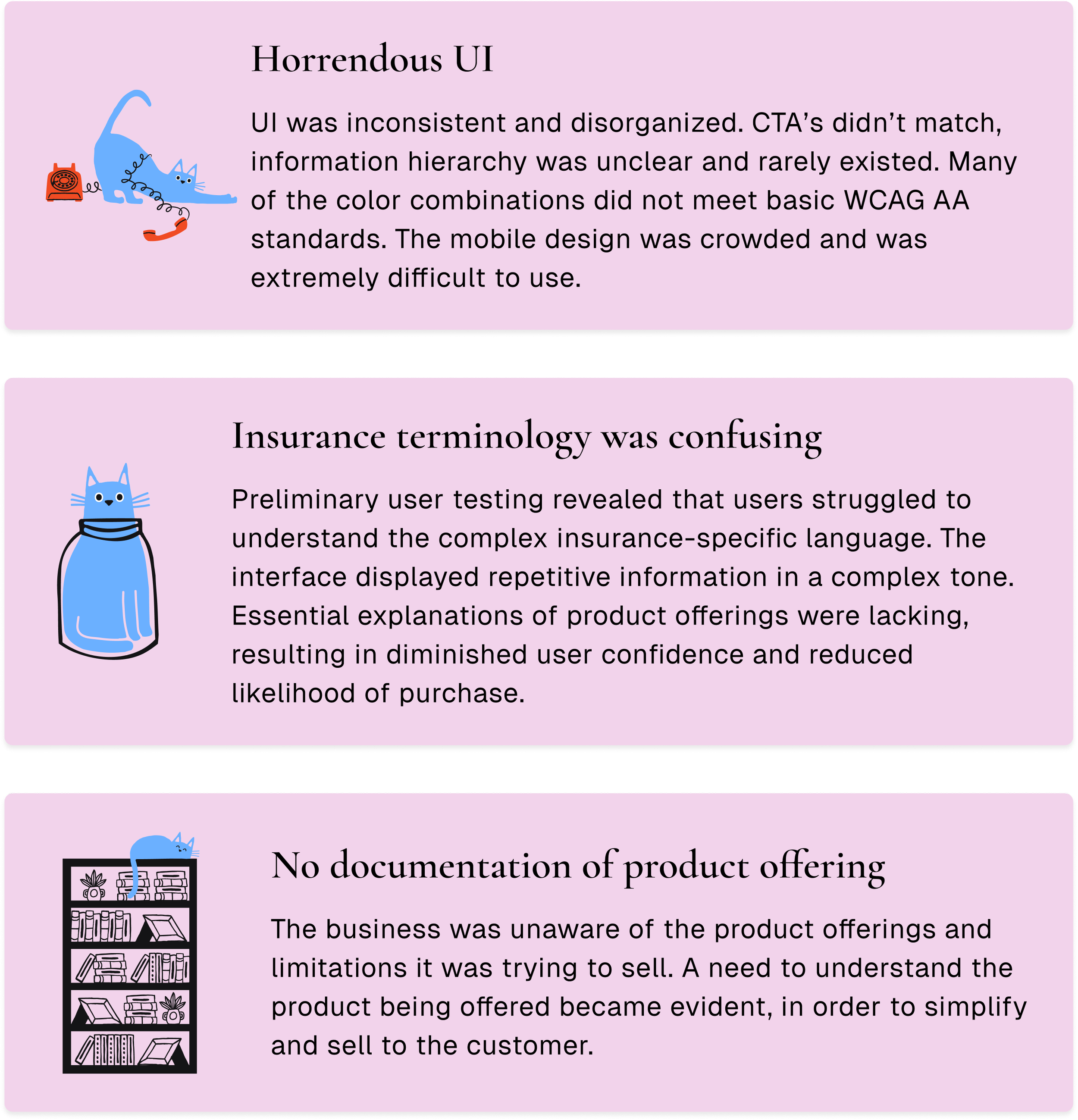
Clear documentation helps everyone
There was no product documentation at all. Part of the UX workflow in this project was to learn and establish a working model of how the insurance product worked, what offerings should be available to consumers, and how to best present this in the UI of the site.
I led the organization of working out these details for our team, which brought clarity to all stakeholders involved, and allowed us to quickly work through ideation and design.
Though it looks clean and simple, this figjam was a result of many investigative and collaborative hours across teams.
User flow of enrollment documented in FigJam
Why branding with UX in mind matters (hint: accessibility)
Upon purchase of the Felix business, a rebrand was conducted, resulting in the adorable cats seen on this page, as well as the colors and styles.
Though the branding is playful to the eye, accessibility was not considered during the original rebrand project. When branding materials came to me, it was obvious that this would not work for UX and color contrast would not pass WCAG Accessibility standards with what I was given.
Thus, I began the 2.0 of the Felix brand, where colors and usage were expanded to include contrast combos that would pass the WCAG AA standards.
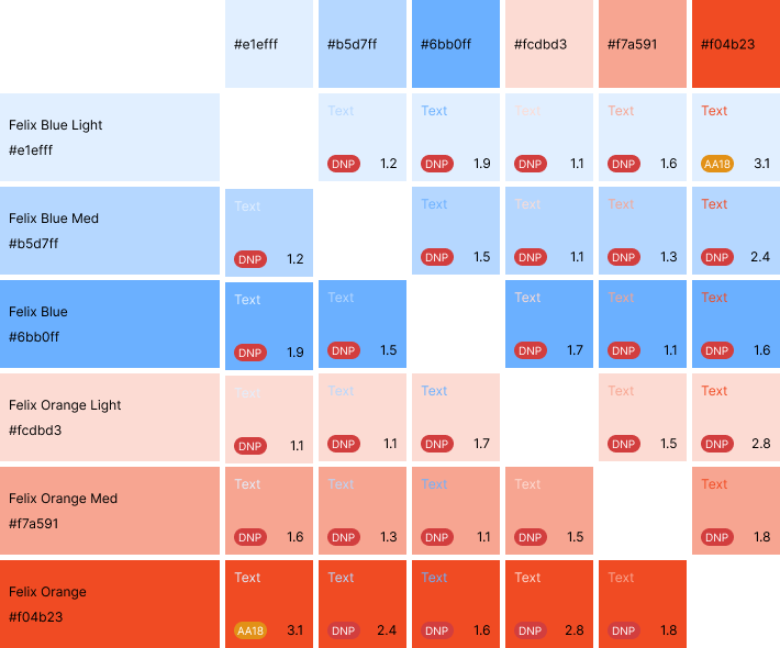
1.0 Felix Colors
I use an Accessibility color gird to determine what color combos will meet AA standards. All red “DNP” tags signify color combs that do not pass.
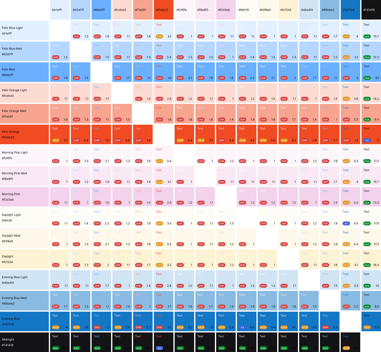
2.0 Felix Colors
Brand colors were expanded to include multiple variations of colors, as well as additional colors to create flexibility to maintain the brand while also meeting AA standards when necessary.
Laying the Foundation for Felix’s Future
Once the new branding, color system, and early Quote & Enrollment concepts were approved, the next critical step was creating Felix’s first-ever design system—because no prior design resources or component library existed. As an emerging leader in the cat insurance space, it was clear Felix’s product needs would quickly expand beyond a single Q&E initiative, so the system needed to support long-term growth from day one.
To keep momentum high, design system building happened concurrently. While shaping new product screens, I also established the foundational components, patterns, and documentation that would become the Felix Design System. Leveraging learnings and structure from my previous system work, Gex, allowed me to accelerate setup and focus on scalability rather than reinvention.
The impact was immediate: a library of ready-to-deploy components dramatically reduced both design and development effort—resulting in an estimated 75% reduction in overall production time.
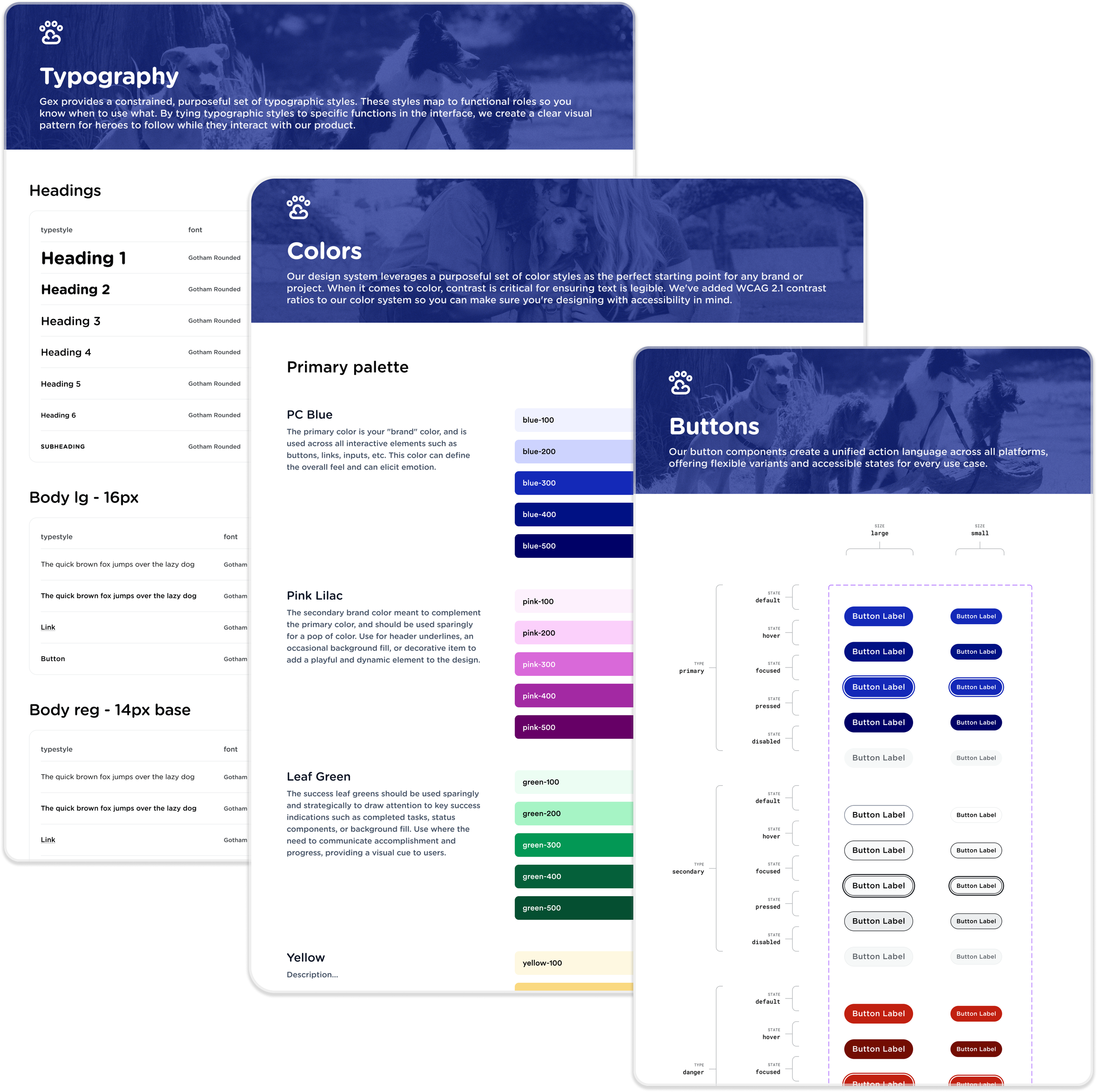
Felix Design System in Figma
Here’s a look into how Felix DS was built in Figma. All base components are built with dev specs clearly articulated and displayed. Plus, several custom components were created for Felix’s Quote & Enrollment flow to improve speed and adaptability when designing and developing.
Where Felix’s Charm Got Lost—and Users Did Too

Before the redesign, Felix’s experience felt dated and confusing, with inconsistent spacing, weak hierarchy, and screens that didn’t reflect the brand’s modern personality. Users struggled to understand their insurance options, often overwhelmed by jargon and unclear guidance. The result was friction at key decision points—making it obvious the product needed a cleaner, more intuitive, and more trustworthy foundation.


From Confusion to Clarity: The Upgrades That Mattered Most
Modern Visual Hierarchy & Spacing
The old screens suffered from dense layouts and uneven spacing. The updated design introduces a clean, spacious hierarchy that guides the eye naturally, highlights key decisions, and aligns with modern accessibility and readability standards.


Clearer Coverage Explanations
Users consistently reported confusion around insurance terminology, so the new design replaces jargon-heavy text with plain-language descriptions, tooltips, and comparison moments that help users understand what each plan actually includes—reducing hesitation and increasing confidence.


Mobile-First, Component-Driven Layouts
User behavior showed that a 75% percentage of visits were mobile, yet the previous experience wasn’t optimized for smaller screens. The new design applies responsive components, simplified interactions, and consistent patterns from the design system—ensuring the flow is intuitive and frictionless across all devices.


Want to see more? This design has been developed and is live!
What We Achieved and Where We’re Headed
The redesigned Felix experience delivered immediate impact: conversion jumped from 0.01% to 4% in four months, directly increasing gross written premium (GWP) as more users understood their options and felt confident completing purchase. The new design system also cut design and development time by an estimated 75%, enabling faster iteration and more consistent product updates.
Looking ahead, the team is expanding the Felix design system to support new product features, deeper quote personalization, and continued refinement of plan education moments based on real user behavior and A/B testing—ensuring the experience continues to evolve alongside user needs and business goals.

Keep Reading

A Better Way to Enroll in Employee Benefits
Transforming an outdated flow into a dependable, scalable entry point for all policyholders in the Pet Cloud ecosystem.
A Unified Design System That Transformed How Our Organization Builds Products
A modular foundation that simplified decision-making, ensured consistency, and cut project timelines by 75%.