


A Better Way to Enroll in Employee Benefits
Transforming an outdated flow into a dependable, scalable entry point for all policyholders in the Pet Cloud ecosystem.
Project Overview
Independence Pet Group (IPG) manages multiple pet insurance brands and products, with a significant portion of its revenue coming from employer-sponsored benefits programs.
Employees enrolling through these benefit programs must register and manage their policies via IPG’s Employer Benefits platform — a system serving over 500,000 users. However, the platform had not been updated in several years and had become increasingly outdated, inefficient, and frustrating for both users and administrators.
This project aimed to design a new, modern insurance registration experience as part of Pet Cloud, IPG’s next-generation policy management system — improving usability, streamlining enrollment, and elevating the overall customer experience.
My Role
As the Lead Product Designer, I envisioned and defined a new end-to-end experience for a large and diverse user base—translating that vision into a cohesive product across web and mobile. The result was a design that balanced aesthetic excellence with practical execution, all to be built efficiently to launch on a tight timeline ahead of Open Enrollment.
This meant:
Owning all product design & design system work
Auditing existing experience to identify key user pain points as to reimagine a better product
Defining the project phases and timelines for deliverables
Collaborating closely with the insurance product team, engineering, and senior leadership to ensure business needs were met
Delivering a cohesive, refreshed experience within the Pet Cloud Web & App.
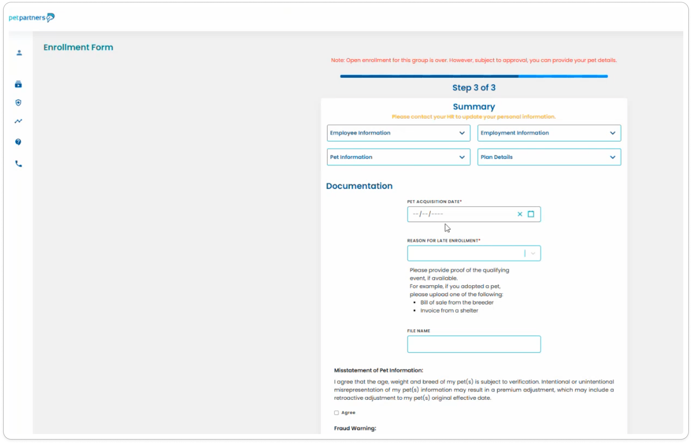
Before
Please forgive the hard-to-see image - there were no previous design files for this project, and this was the only reference given to me 🙃
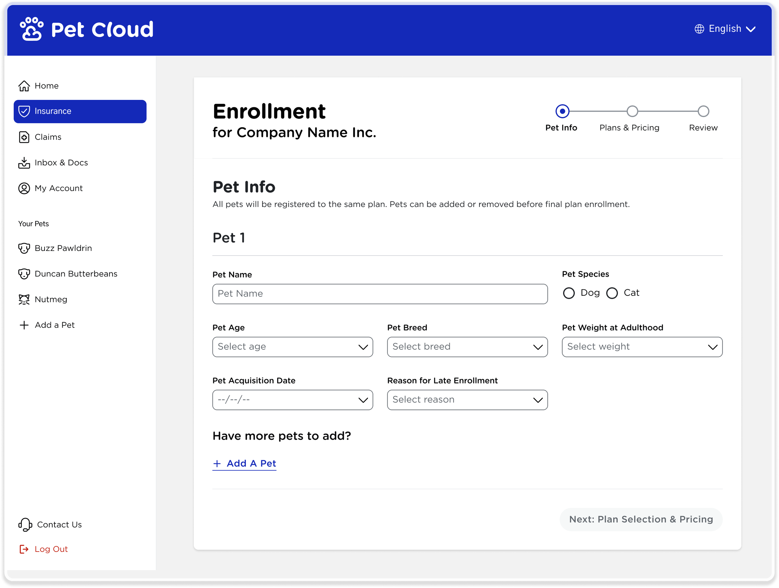
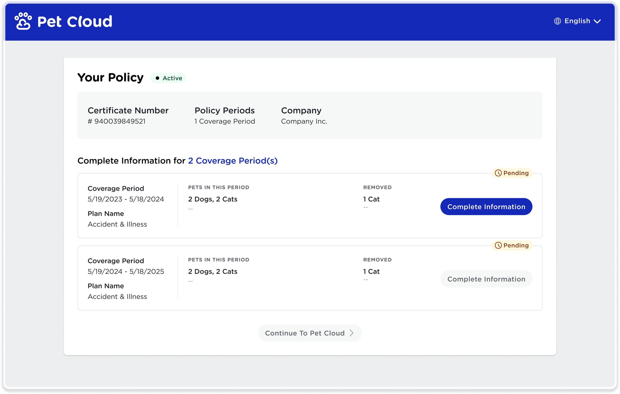
After

The Problem
The previous Employe Benefit plan selection and registration was visually outdated, filled with redundant information and lacking details that were important, was inconsistent and causing confusion at every click. The first impression these users were getting of IPG was...lacking, to say the least.
On top of the front end user experience, there were no design assets or materials that existed and were crucial to this project. We needed to work fast, and also create a foundation for future design work.
This was a design project that needed to balanced user needs, business needs, and engineering needs - with a very tight deadline to meet.
The Solution: Listening before jumping to design
I started by talking to the people closest to the pain:
New policyholders who had attempted onboarding
Customer support agents who fielded the frustrated calls
Underwriting, who needed accurate data
Policy administrators, who were using the current designs more than anyone
Engineers, who had to handle inconsistencies
Patterns emerged quickly, and I quickly identified several areas to focus on to solve the problems presented for this project. Our team was in agreement these were the areas we needed to put the majority of our efforts into:
Key insights:
Simply put - there was no intuitive design in the current flow. CTAs were inconsistent, there was no color hierarchy, errors differed on each screen, and there was no logical flow.
Product offerings were outdated, unclear and confusing to both users and policy administrators alike. Copy was filled with insurance jargon that didn’t make sense, information was repetitive but not complete, and required actions of users didn’t make sense.
The legacy flow required too many screens, inflating completion time.
The experience did not translate well on mobile
WCAG AA standards were nearly non-existent, posing great risk to the organization
Before Redesign
-
![]()
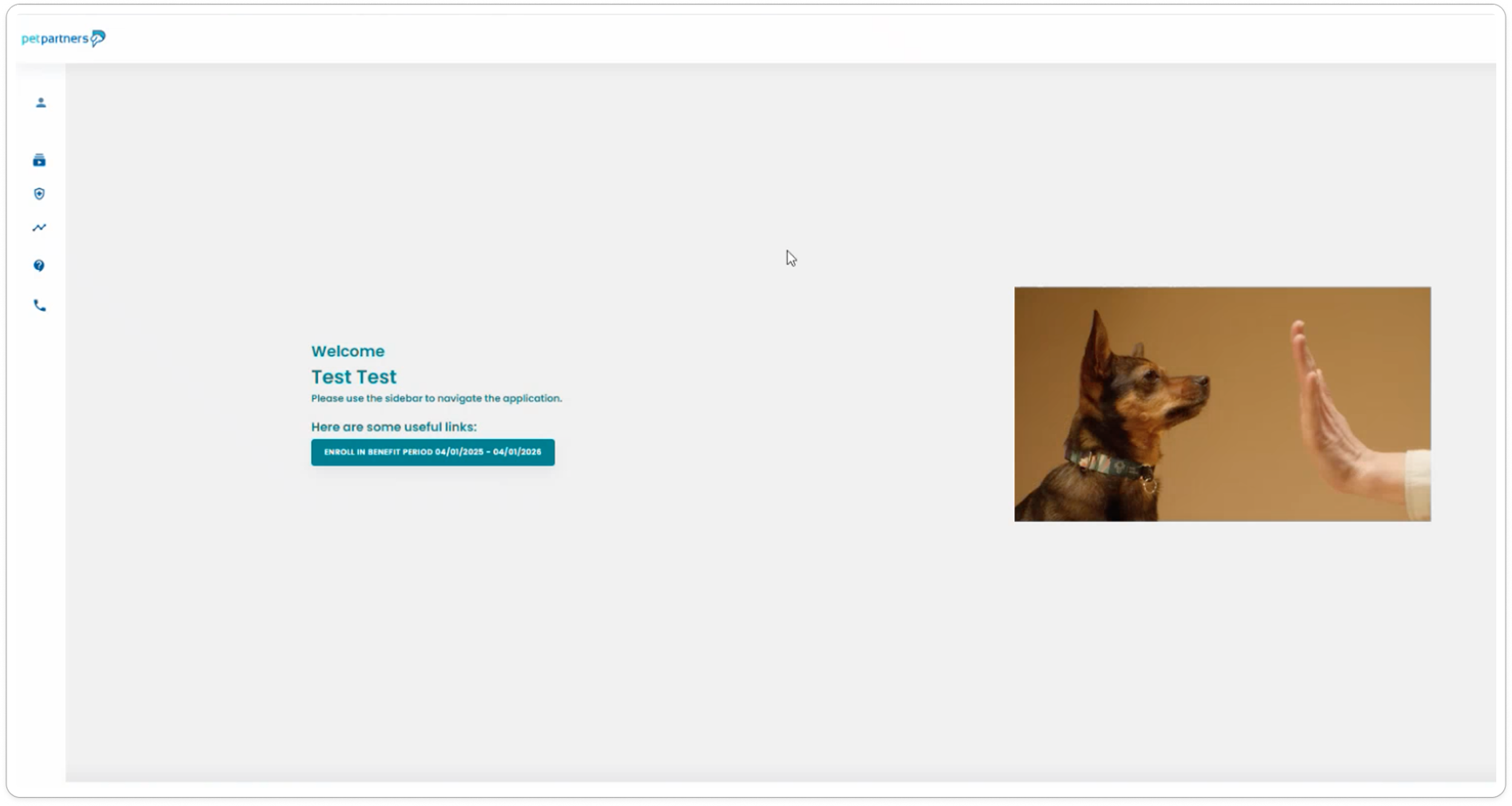
Step 0 - Enrollment Home Page
-
![]()
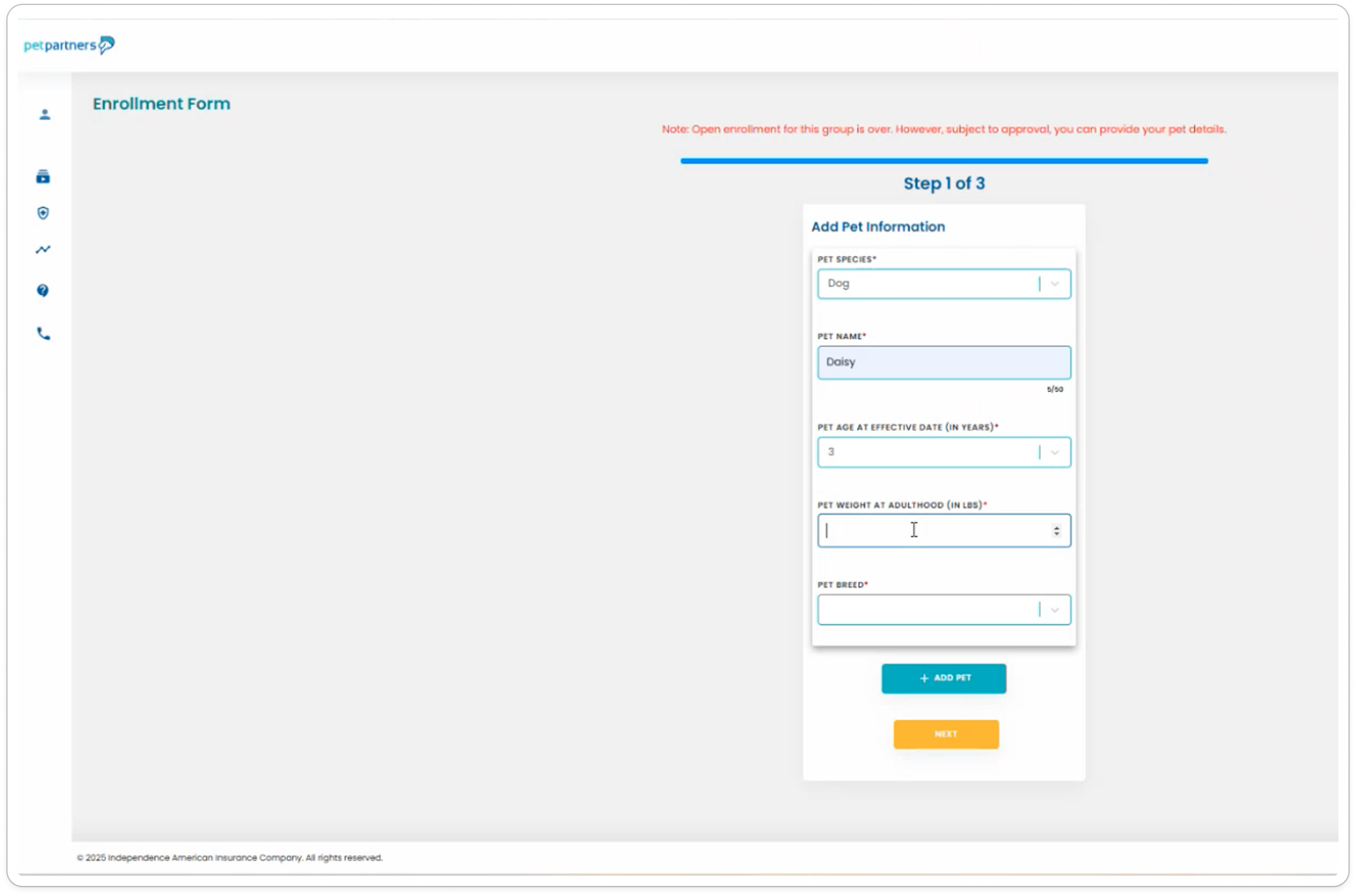
Step 1 - Add a Pet
-
![]()
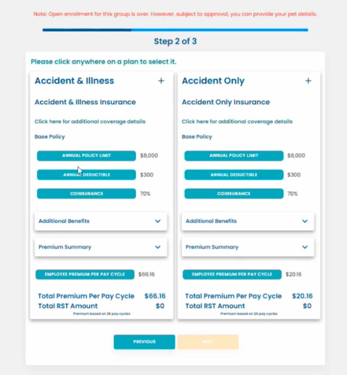
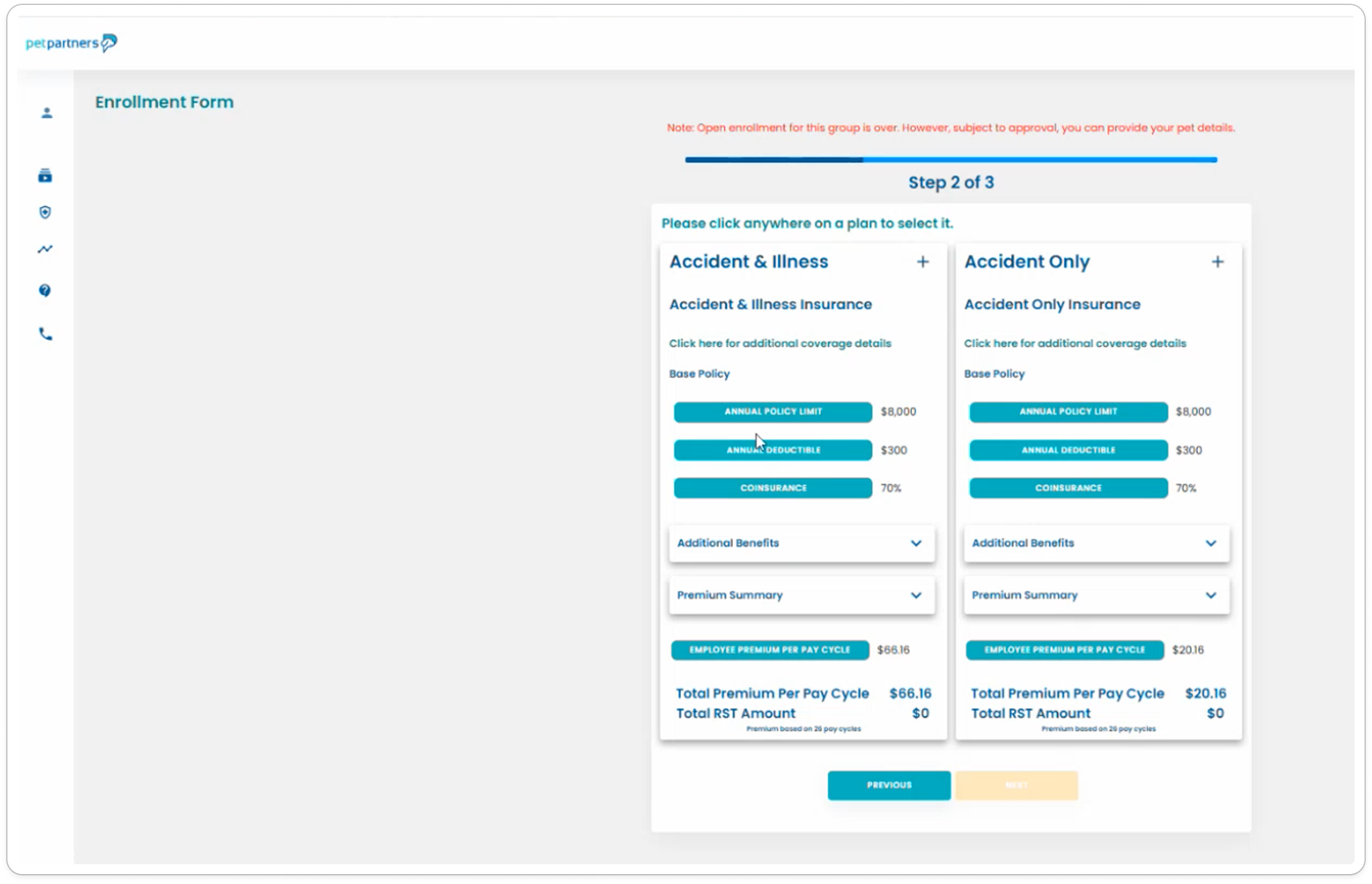
Step 2 - Select Coverage
-
![]()
Step 3 - Review & Checkout
Impact & Improvements
Clearer insurance guidance in fewer steps
We translated confusing insurance requirements into simple, user-friendly explanations, reducing workflow steps and cognitive load. By restructuring the IA and surfacing underwriting needs at the right time, we lowered error rates and made enrollment more predictable.

Intentionally lowered the need for CX support & improved accessibility
By building long-standing edge cases directly into the product, we reduced reliance on customer service and decreased future support burden. Accessibility updates increased the platform’s WCAG score by 70%, improving clarity and inclusivity for all users.


Delivered High Impact Within Heavy System Constraints
Despite significant backend and data limitations, we designed a solution that worked within the system’s boundaries while still improving UX at scale—unlocking a modern enrollment experience without requiring major engineering overhaul.

Visualizing the Flow With Figma Make
To better align design and dev, we leveraged Figma Make, Figma’s new AI-powered tool, to illustrate complex flows and generate early code snippets for developers. This accelerated implementation, clarified design intent, and gave dev teams a head start with production-ready patterns.
In addition to the primary enrollment experience, we also designed an in-app registration flow for a second employee-benefit segment—users who needed to add pet demographics to activate their insurance.
This additional workflow is also captured in the Figma Make video below, showcasing how this path was articulated and communicated to dev.
Obstacles That Shaped the Solution
The project faced significant backend and data limitations, long-standing UX debt, and wide variability across benefit partners. Many user scenarios weren’t previously supported in-product, contributing to high support volume. Tackling these constraints required rethinking flows from the ground up while maintaining feasibility.
Despite this, we improved accessibility by 70%, addressed major edge cases, and delivered a scalable system under tight Open Enrollment deadlines.

Where the Work Goes Next
Next, we will expand the enrollment framework to additional benefit types, integrate deeper analytics to monitor completion and drop-off, and continue maturing the design system to support ongoing growth. There is also an opportunity to further personalize guidance, streamline mobile interactions, and extend the scalable patterns developed here into other areas of the Pet Cloud ecosystem for broader organizational impact.
Keep Reading
A Redesign That Grew a 0.01% Conversion Rate Into Real Revenue
A thoughtful redesign that aligned customer needs with business goals—plus the right UI polish—transformed a failing insurance purchase flow into one users could trust and complete.
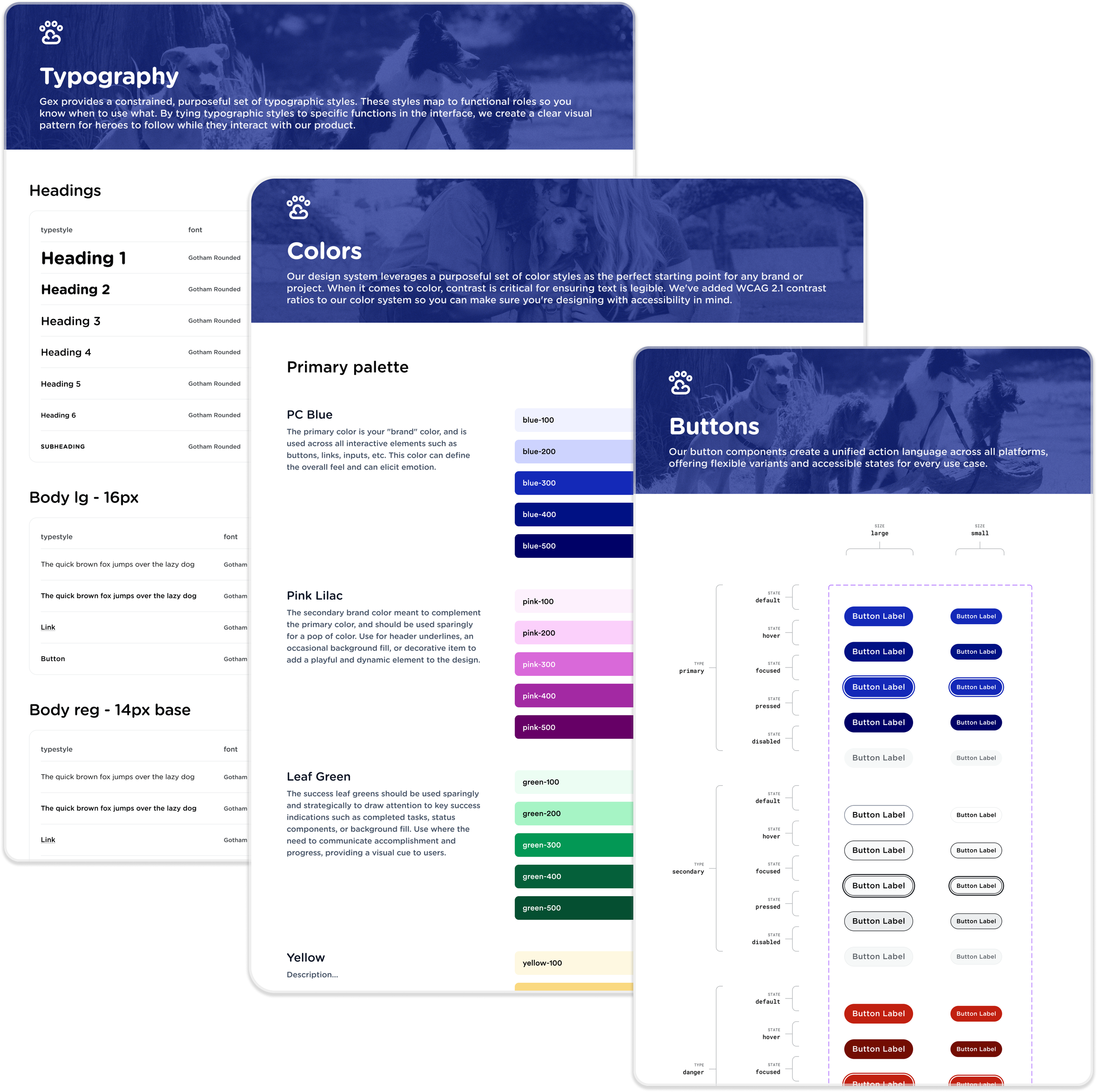
A Unified Design System That Transformed How Our Organization Builds Products
A modular foundation that simplified decision-making, ensured consistency, and cut project timelines by 75%.